


Porto Ferreira, the historical Port Wine brand, is celebrating its “Portugality” with a packaging collection entitled “O meu Porto seguro” (My Safe Port), referring to the feeling of comfort and safety that only a safe harbour like our home can provide.
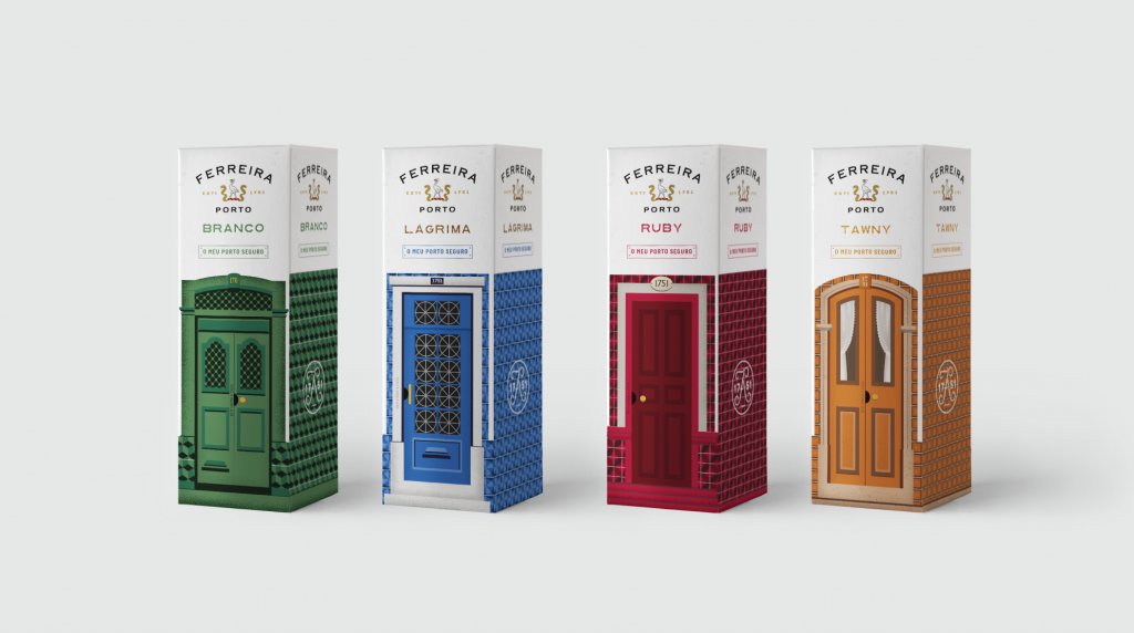
The materialization of the concept, authored by Volta – Brand Shaping Studio, was achieved through four historical traits of Portuguese houses, corresponding to the four references of Porto Ferreira — Lágrima, White, Tawny and Ruby — with elements shared in the collective imagination: laundry hanging at the window drying, a cat, the Portuguese flag, and flowerpots on the balcony dressed in typical tiles. Behind every window, the silhouettes of the dwellers hint to their happy gathering with friends and family, in a true Portuguese style.
Committed with the most profound values of “Portugality”, Porto Ferreira celebrates the origin, tradition, quality and authenticity translated in wines that are staple in the moments of celebration of the Portuguese families, but also in original packaging celebrating a unique and timeless identity.